From agricultural green to credible fintech

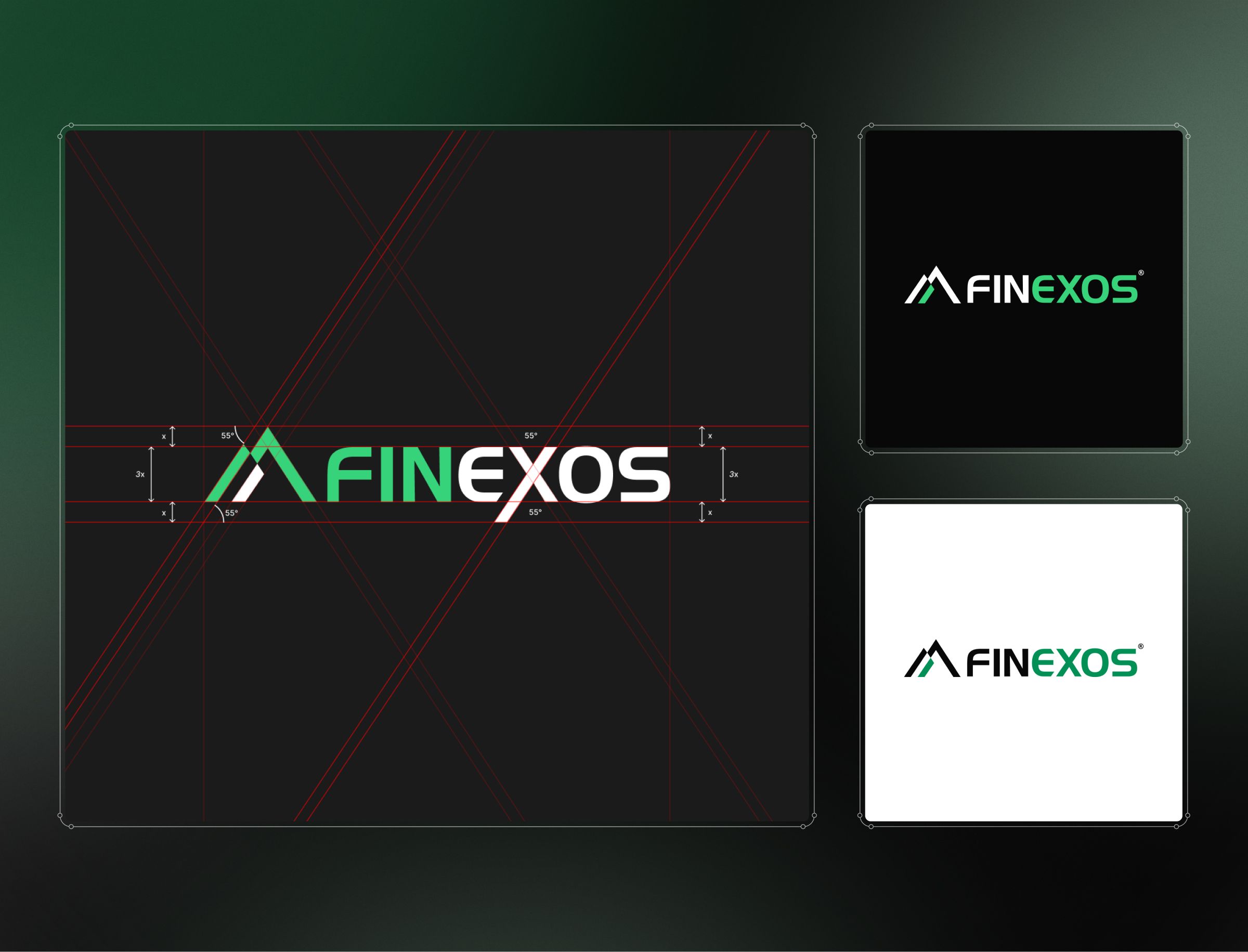
A capable platform wearing the wrong brand
Finexos is a fintech founded in 2023, building custom software for the finance industry. At the centre sits a patented, AI-driven platform called Fiola that calculates financial capability, risk and profitability. The capability was high-end. The brand was nowhere near it.
The existing identity leaned on an emerald mountain metaphor that read as agricultural, which is a problem when the clients you are pitching include contracts at the scale of IBM. Finexos needed to look like a company that belonged in those rooms. The project was not a build from scratch but a strategic refresh: keep the company as it is, and move the brand to where the business already operates.
Rebranding and rebuilding the website side by side
Salo set the creative direction as dark and dynamic, the visual language that reads as credible in finance technology. The aim was for Finexos to look like it belonged beside the established names rather than a tier below them.
The rebrand ran in parallel with the website rather than in sequence, and running them together turned into an advantage. Decisions on one fed the other, letting the identity develop while the site took shape, which produced a coherent visual system without stopping to rebuild the conceptual story every time something shifted.
We led brand strategy and visual identity, and produced the practical collateral a company needs to look established: templates, slide decks, banners and flyers. Complete partnered on delivery, contributing content, video and animation.
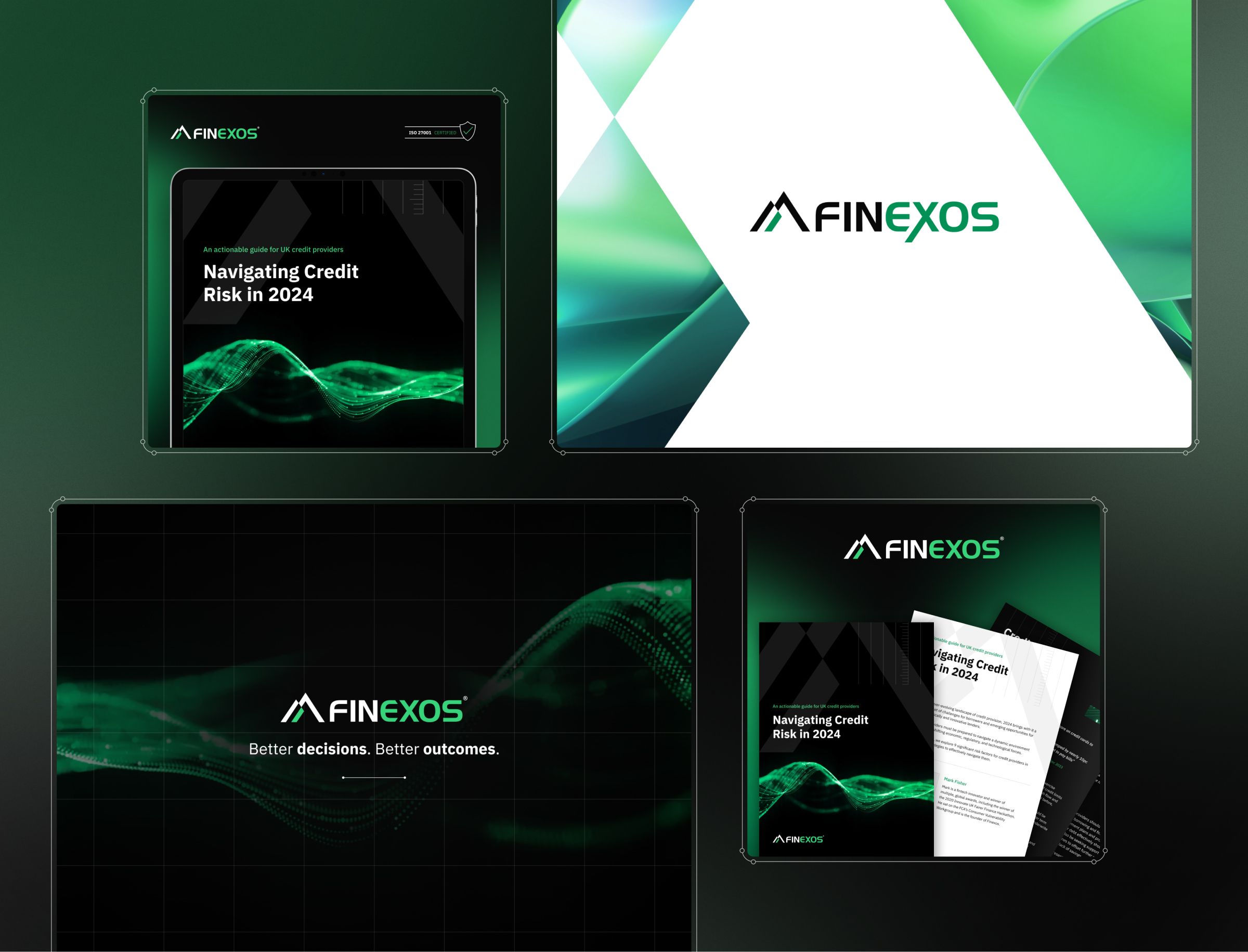
Credibility the team can now produce on its own
Finexos came out of the project with brand consistency it did not have before, and the toolkit to keep it. The identity reads as credible, and the templates let the team keep producing on-brand material without returning to us for every piece.
The practical result was speed. Finexos could go to market faster and looking the part, which for a start-up entering a market full of banks and established lenders is not vanity but the price of being taken seriously. Validation has since come from outside, which carries more weight than anything we could claim on our own behalf: Finexos has gained industry accreditation and performed in the market.