A store engineered like ultralight hiking gear

Two numbers matter: weight and capacity
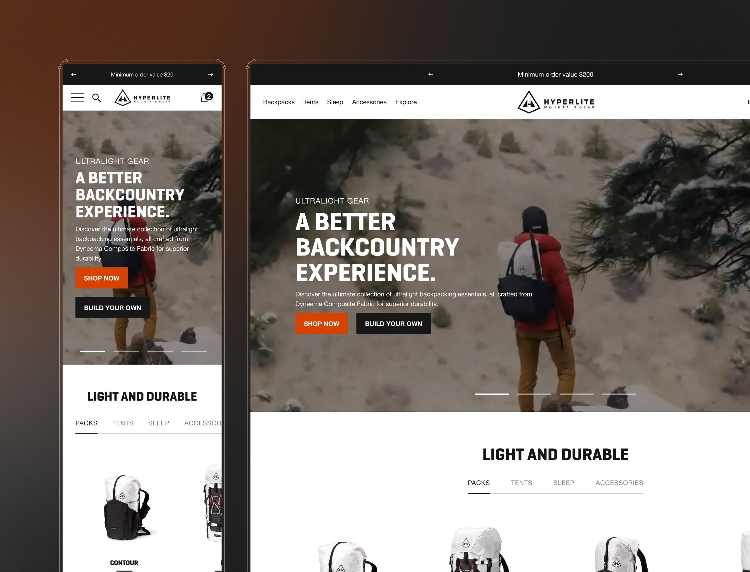
Hyperlite sells ultralight mountain gear: backpacks from 40 litres up to 70 litres, plus tents, sleep systems and accessories, all made from specialist woven composite materials. Their customers are professional hikers and mountain climbers who choose kit on hard criteria, not impulse. For that audience, two numbers decide everything: how much a pack can carry, and how little it weighs.
Hyperlite came to the project through Roswell, who brought Salo in to design the store. The work was white-label: we designed, Roswell built. The goal was a Shopify store that reflected the brand and put the lightweight nature of the products front and centre, so a specialist buyer could find exactly the right setup without wading through the catalogue.
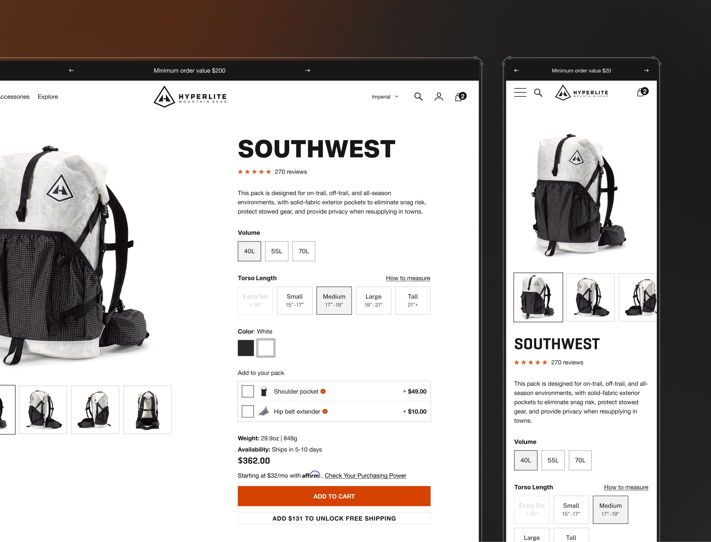
The catch is that these are not simple products. A customer does not just pick a backpack. They configure one, choosing pocket types, bottle pockets, internal back pockets and shoulder pockets to build the pack around how they actually hike. The store had to make that configurability feel clear rather than overwhelming.
Weight and capacity as the organising idea, not an afterthought
The starting point was the buyer's real decision. Customers needed to identify the right product by the weight they were willing to carry and the volume they needed, so weight and capacity became organising principles of the experience rather than spec-sheet afterthoughts. In the cart, the design surfaces the total weight of the order, a small detail that matters a great deal to someone counting every gram on their back.
Discovery came first. We ran the design phase end to end, working directly with the client through discovery sessions and information architecture, then component mapping: taking screenshots of the existing Shopify theme, then reordering and reorganising components to get a clear feel for what each page actually needed. The store was built on a theme, so the task was to customise over the top of it rather than start from a blank canvas.
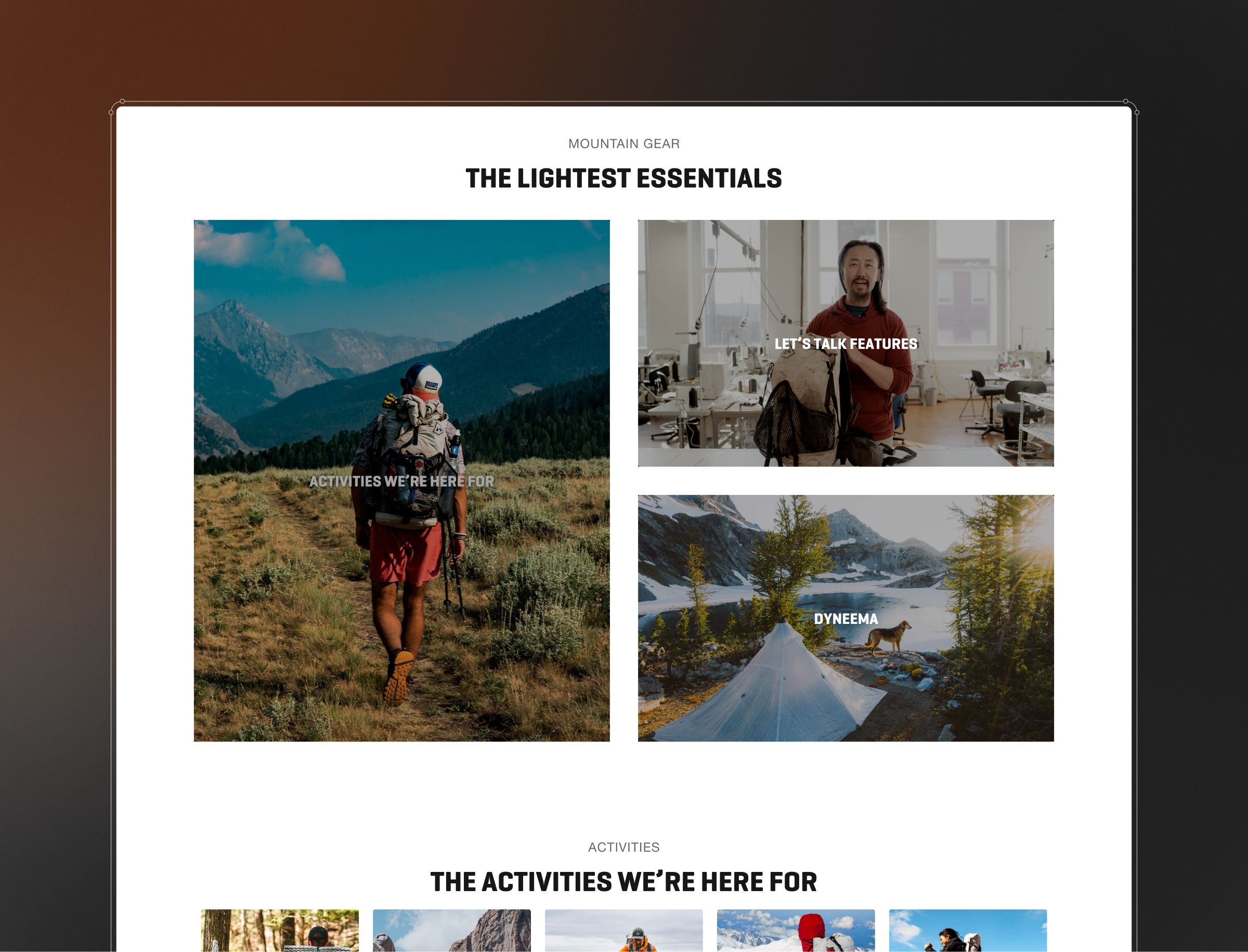
The design is deliberately minimal. Products sit against clean black and white, with bursts of colour coming from lifestyle photography of customers using the gear in the wild. Orange is the single accent, used sparingly and only where it earns attention: offers, add-to-cart, CTAs. That restraint is the point. The monochrome aesthetic keeps the focus on the products and the photography, while the orange does the work of guiding the eye to the next action.
Beyond the core shopping flow, the store gives buyers several ways into the range. Customers can shop by activity, from backpacking and fast-packing to backcountry skiing, bike-packing and canyoneering, so the route to the right kit matches how people think about their trips. Informational pages cover the material science behind the woven composites and how to build a backpack system, alongside proof from real customers using the gear outdoors. The commerce fundamentals are there too, including a sticky cart and free-shipping eligibility, adapted around the common behaviours of a hiker rather than a generic shopper.
A tool for gram-counters, not just a catalogue
The store tells the brand's story better than before, and it gives the end customer information they simply did not have. The features built around weight, the weight of individual bags and the total weight of an order, did not exist on the old site. For a buyer who chooses gear by the gram, that is the difference between a catalogue and a tool.
The result is a store that makes it genuinely simple to identify the right backpack, narrow by category across backpacks, tents and sleep systems, and configure a setup that fits how someone hikes. Clean, detailed where it counts on the product descriptions, and never more complex than it needs to be.
Project leads

Carl Cahill