A brand built to define a category


A category with no visual language of its own
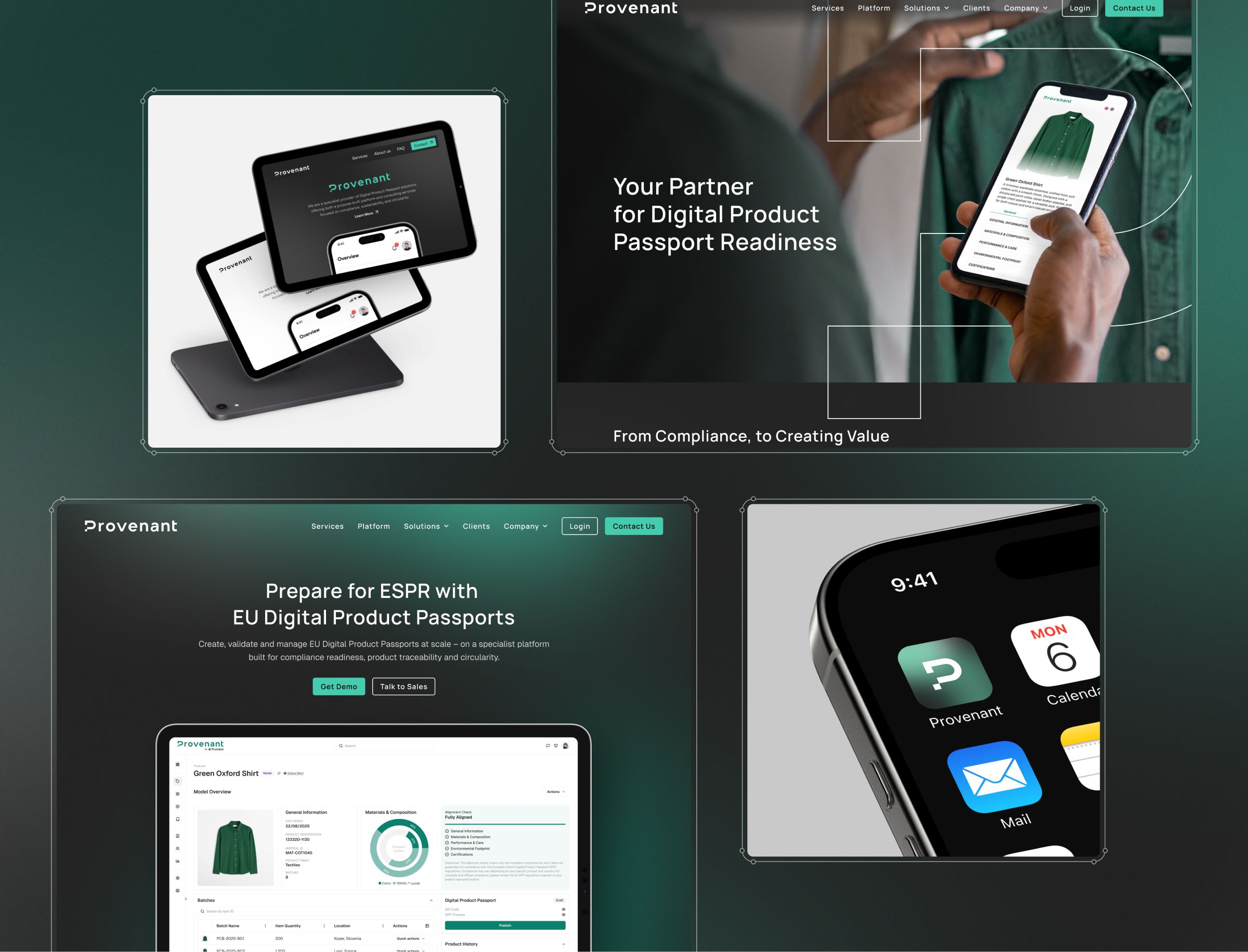
Provenant is a compliance-tech start-up building digital product passports, the digital records that let retailers meet incoming EU regulations on what a product is made of and where it came from. Compliance software has a look, and it is a dull one, the kind of thing people put up with rather than engage with.
Provenant wanted the opposite. They came to Salo in 2025, early enough that the brand could help define a category rather than just decorate a product. The brief was an identity that felt modern, positive and confident, one that invites people in rather than adding friction to a subject most already find dry. They commissioned the full package: brand strategy, visual identity, logo design, and the physical and digital collateral a new company needs, from business cards to slide decks and templates.
Workshops, sketches and AI iconography setting the direction
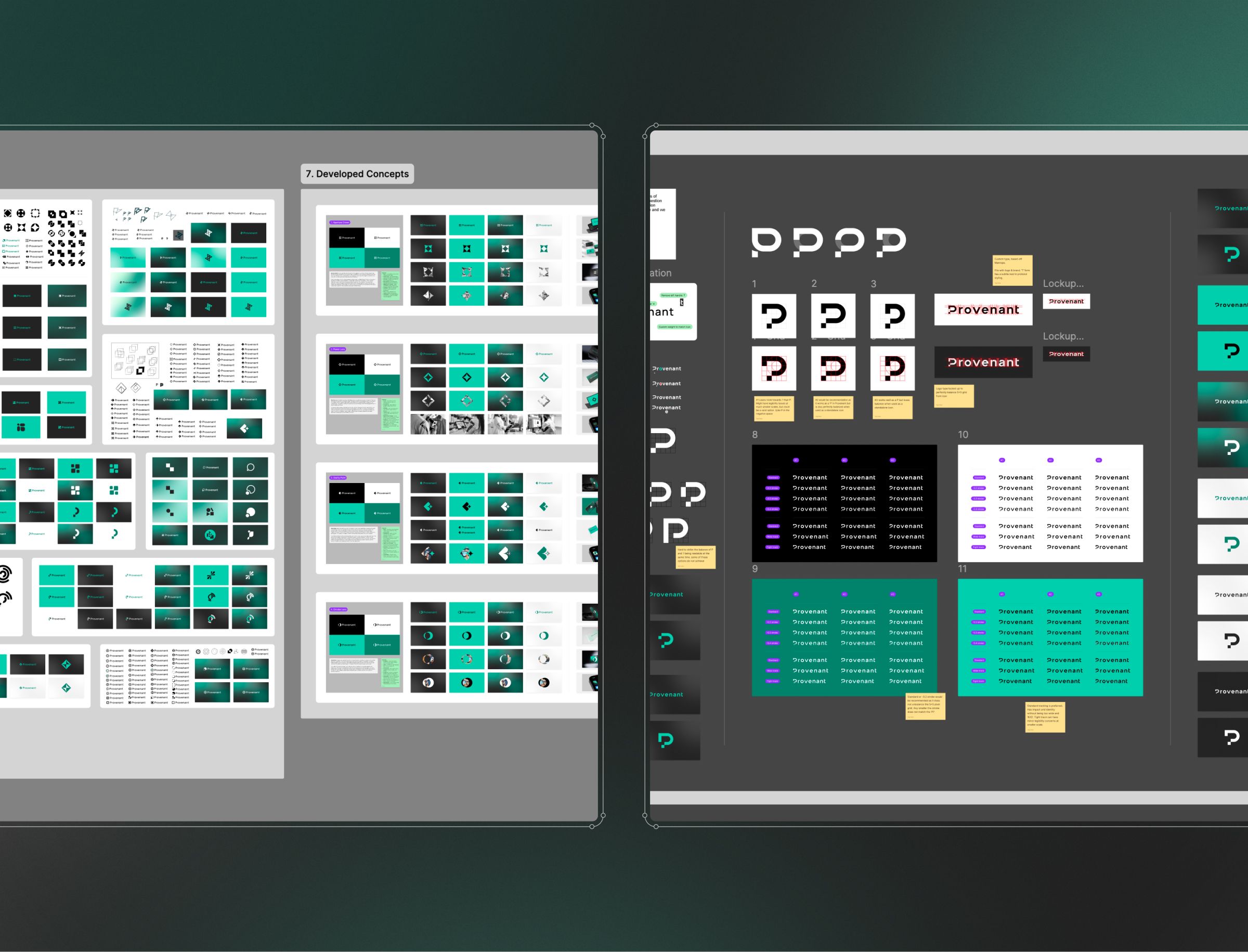
The project opened with a discovery workshop to work out what the brand needed to stand for and where the product was heading. That session produced a set of keywords, sustainability, integrity, confidence and circularity, which became the brief for creative direction.
Rather than hand the direction to one person, we had several of our team each sketch their own interpretation of those themes, then set the sketches alongside AI-generated iconography to find the patterns worth pursuing. That comparison set the direction for the first round of logo and visual exploration. We settled typography and colour early, fixing a clean, tech-focused tone before the wider identity was built out.
A system proven by use, not just by design
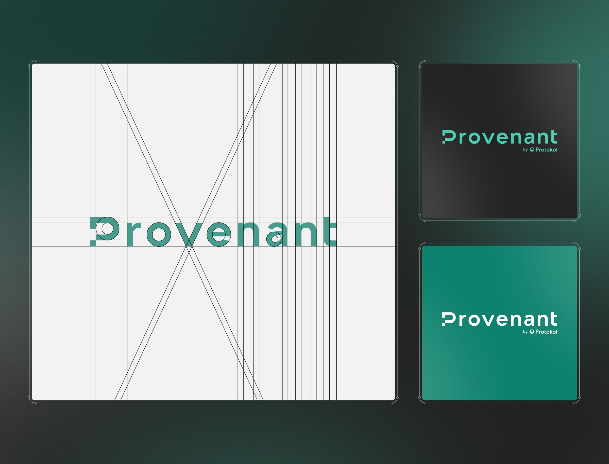
Provenant came away with a complete identity, a visual system, and the marketing assets to put them to work, a brand that reads as modern and confident rather than the usual compliance-software look. That gave the founders confidence in how the company presents itself as it takes a new product into a regulated market.
The identity also held up beyond the screen. Provenant has since scaled the brand across both digital and print, which is the real test of an identity system: whether it keeps working once it leaves the original designs, or only ever looked good in a presentation.
Choosing Salo Creative as our specialist brand and design partner for our new company Provenant was a fantastic decision. It’s rare to find an agency that can fully understand a client’s vision and translate it into something meaningful, but Salo did exactly that. I can’t thank Carl, Toby and team enough for developing an authentic brand that we’ve scaled across both digital and print. I would highly recommend Salo Creative to any company that has similar requirements, and I look forward to working with them on future projects.
Project leads

Toby Felton