A confident website design for fast-growing clinical software

A platform that had moved on, and a website that hadn't
Stitch builds patient engagement software for clinical research sites. Its platform had moved on, but its marketing website had not: the site still showed the old interfaces.
With a US event coming up, Stitch asked Salo to refresh the website. The brief had three parts: show the platform as it looks today, give the site a modern look and feel, and have it ready in time for the event.
Building on the design system we had already improved
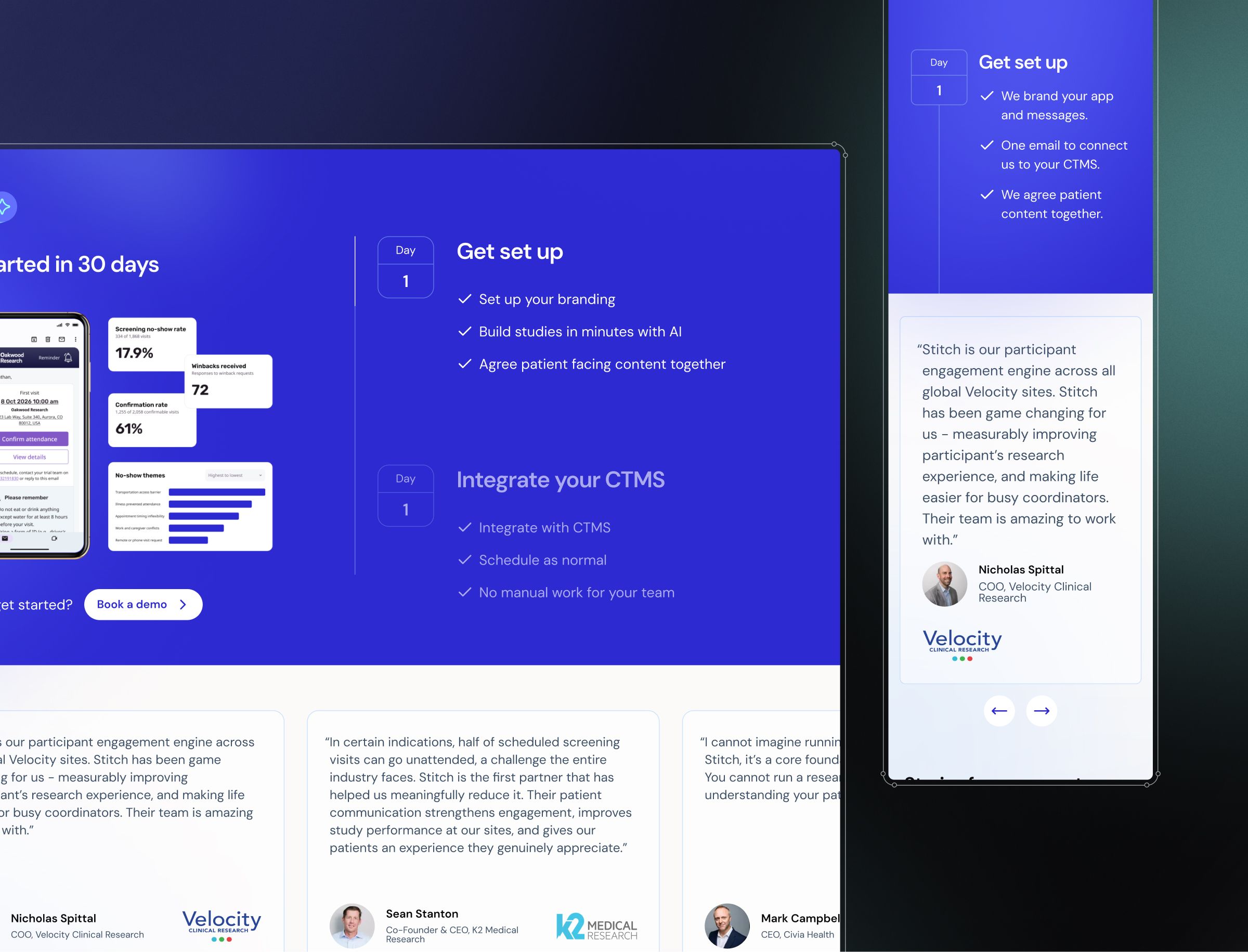
The website grew out of our earlier work on Stitch's platform, where we improved the design system behind the product. That work surfaced three problems: a colour palette limited to purples and blues, too little colour depth to tell interface elements apart, and accessibility issues around colour. We fixed them without a rebrand, standardising the system around best practice.
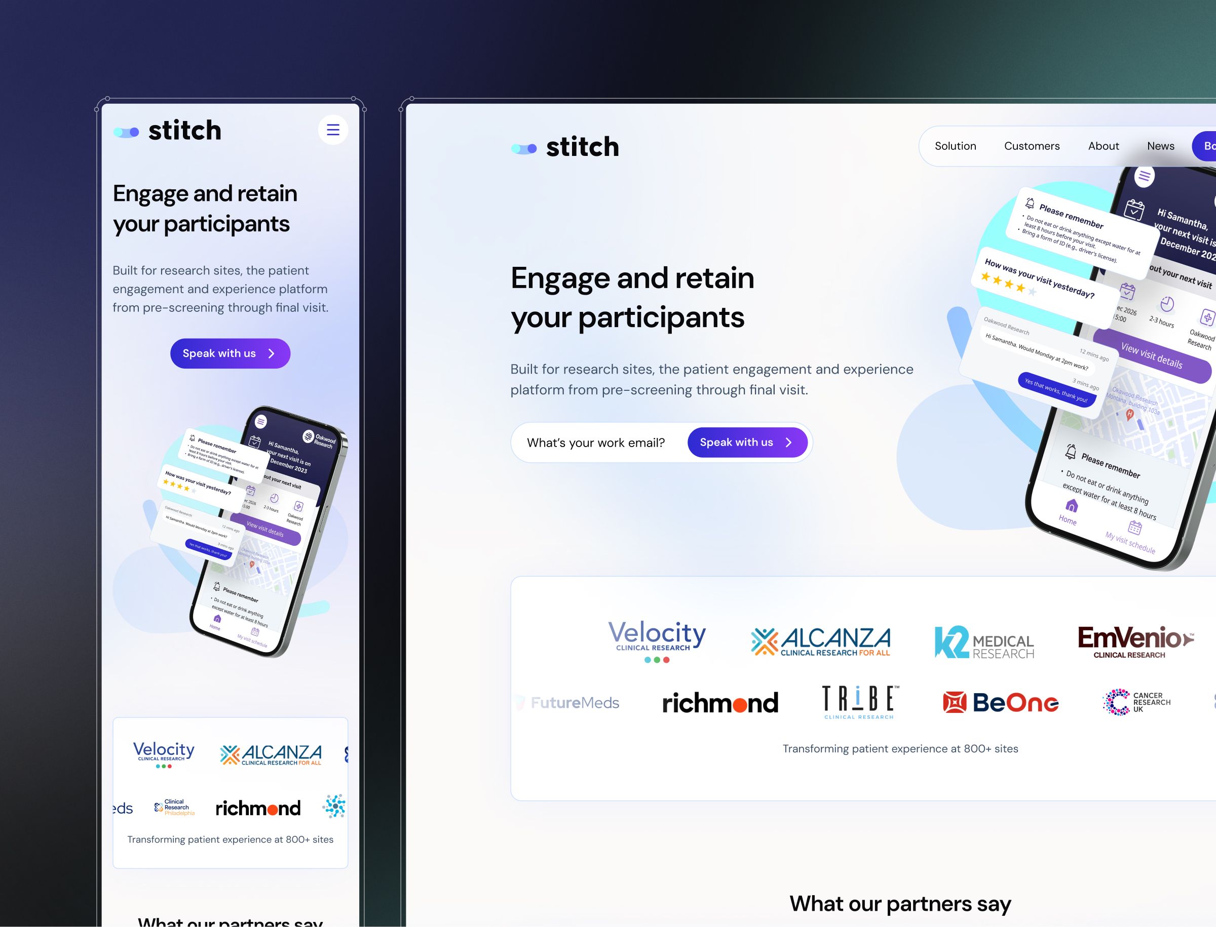
We carried that thinking into the website. A broader colour palette gives the pages more range, buttons have more depth so they stand out, and the type hierarchy is clearer, with dark headlines over slightly lighter body text. Soft blurs, background movement and bold shapes add depth and energy, while more generous spacing keeps every page easy to read.
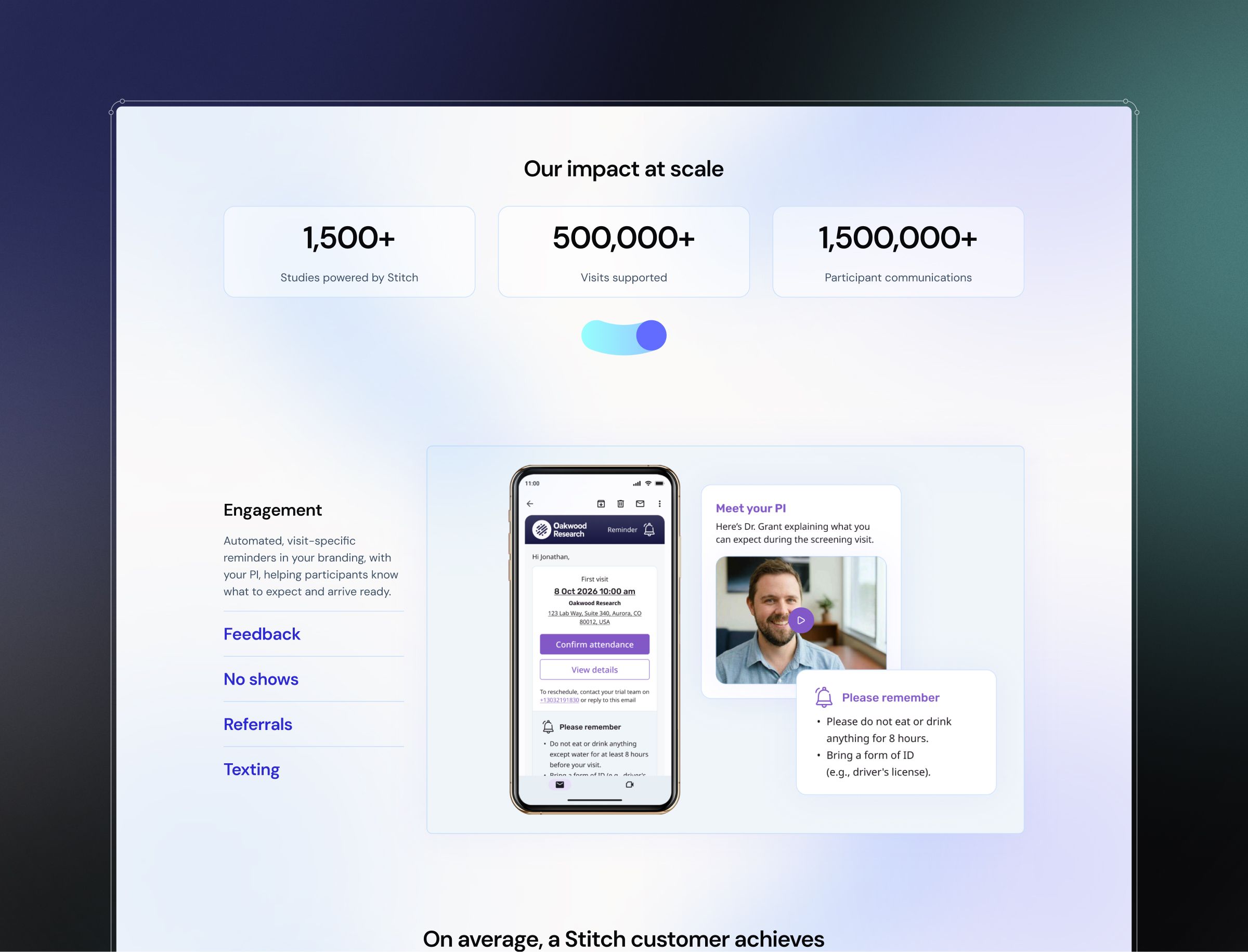
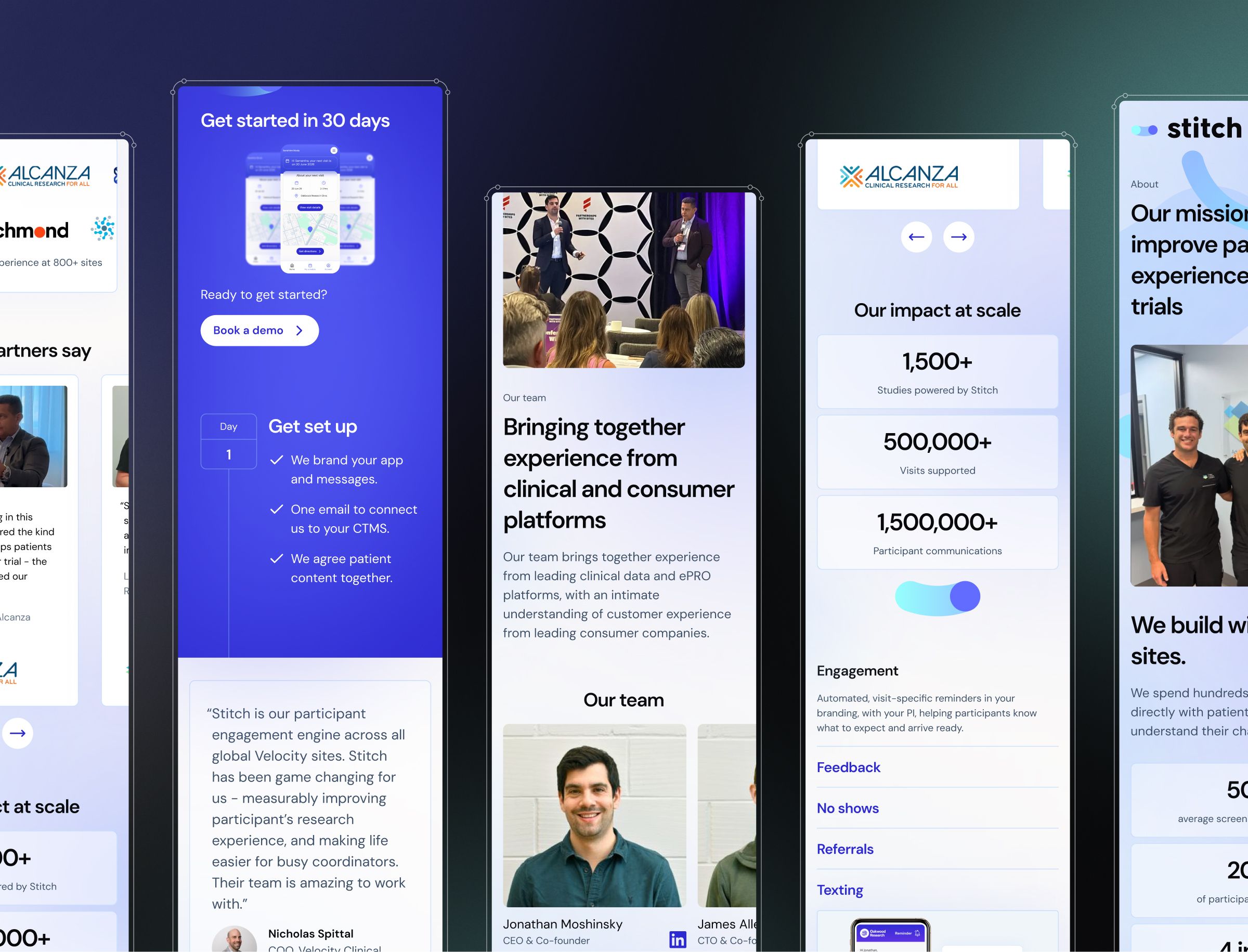
We shaped the content and structure closely with Stitch's sales team. We explored several homepage concepts, then designed a solutions page that walks through the platform's features, a customers page with visual case studies and improvement stats, a case study page, an about page that shows the team's personality and how they work, and a news and partnerships page.
Stitch's sales team wrote the banner copy and we finessed it, giving the banners clearer language and stronger visuals. We added social proof through client logos and testimonial videos, plus more product demos and interactive click-throughs, so prospects can see the platform in action. Fixed and scrolling elements keep the pages feeling alive, and booking a demo is easy from anywhere on the site.
We presented a Figma prototype for every page, and Stitch stayed closely involved at each stage. Stitch's team then built the site from our designs.
A modern website, on time for the US event
Stitch had fully responsive designs for every page in time for its US event. The website now shows the platform as it is today, in a look that matches the product rather than trailing behind it.
The website sits alongside our continuing work on Stitch's platform, so the product and the site it is sold through now share one design language.